Transforming ICSR Reporting: Reducing Case Processing Time by 40% and Boosting Productivity with Gen AI Automation
Project Overview
Our client, a leading pharmaceutical company, faced challenges with their manual Individual Case Safety Report (ICSR) tool. The existing process was prone to errors, time-consuming, and impacted regulatory compliance. To address these issues, we collaborated with the client to automate the reporting process using Generative AI. Our goal was to streamline workflows, reduce human involvement, and enhance user experience without disrupting established processes.
Team
Designer (Me), UX Architect, Product SME, 3 Backend Dev, 2 Frontend Dev, 3 LLM Scientists, 1 Data Engineer
Client Impact
40%
Improved Accuracy
1.5x
Enhanced Productivity
80%
Reduced Manual Interaction
100%
On-Time Report
17%
Reduced Operational Costs
Highlights of the Project
Users struggled to prioritize tasks in ICSR, leading to delays and inefficiency. We created a dashboard that categorizes tasks by priority, streamlining workflows. This resulted in faster task completion and a drop in missed deadlines.

Users spent too much time manually finding names, emails, and details in the general view. With AI-powered mapping, details are now extracted instantly, saving time and effort.
On the product page, users can find relevant medical products through AI-driven search. Relevant products are extracted automatically, saving time and significantly reducing errors.
Introduction:
Why are we doing this? A journey from POC --> Prod Env
So, As we have successfully completed the Proof of Concept phase, Business where satisfied and gave us green signal for Production. In this stage, I was the only designer working alongside our PM, Devs and Data Scientist team. Finally, They have liked the entire Idea and we are now in Phase 1 of the Production for ICSR.
Some Glimpses from POC:


So, We tracked some key impacts and Business Efficiencies that needs to be Identified and Processed in this Production
Manual Process Time
Each case took around 45 minutes to process.
Accuracy Rate
Only 85%, leading to frequent errors.
Productivity
Limited to 10 reports per user per day.
Defining Process
Understanding Key Deliverables and Timeline
As we Started, We got along with the team to understand the timeline and key deliverables and the sprint module. I was accompanied by Solution Architect and Business SME for this production. And we were planning how the Design is going to happen from scratch to deliver.
As we are going to follow Agile Methodology, We must
Discover by connecting with clients to gather user stories.
Define the solutions based on research and insights.
Ideate and build designs collaboratively.
Validate the designs with business and users for feedback.
Finally, hand off the designs to development.
DISCOVER
DEFINE
IDEATE
VALIDATE
ITERATE
ITERATE
So, We did...
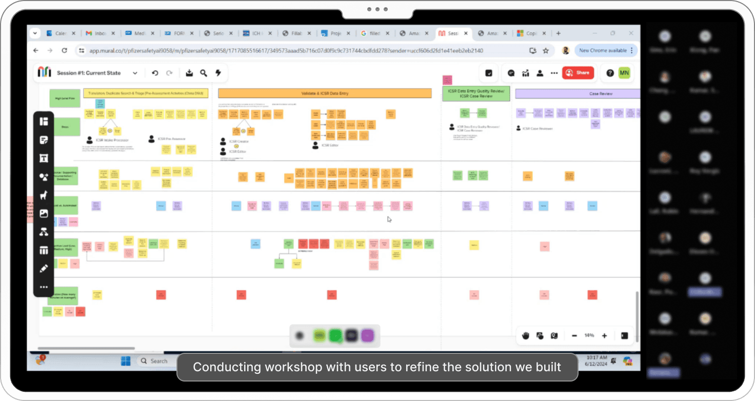
Conduct Workshops to Gather User Stories

Defining the Solutions
Validate Design Solutions with Business/Users

Conducting workshop with users to refine the solution we built
General Tab
Designing General Tab brings 90% of the solution as these are the key elements throughout the product, So, We took this sprint to make sure we get this right.
We Initially Started with Deep Research to Understand User Needs and Define MVP1
Workshops with Stakeholders and Users:
We started by conducting workshops with business stakeholders and end-users to understand their workflows, challenges, and expectations. These sessions helped us uncover key pain points and areas for improvement.
First Sprint Focused on User Insights
The first sprint was dedicated entirely to gathering insights and translating them into user stories. This ensured our work was aligned with real user needs and priorities.
Identifying Critical Features for MVP1
Through this process, we identified the most critical features to include in MVP1, focusing on solutions that would deliver the most value to users.

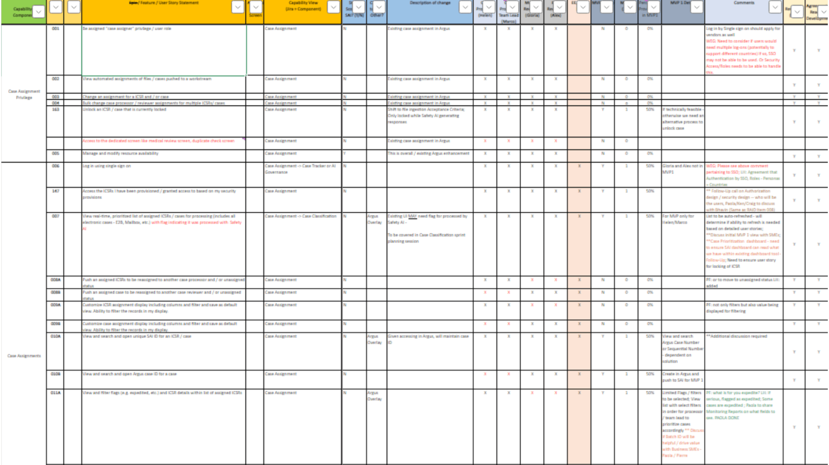
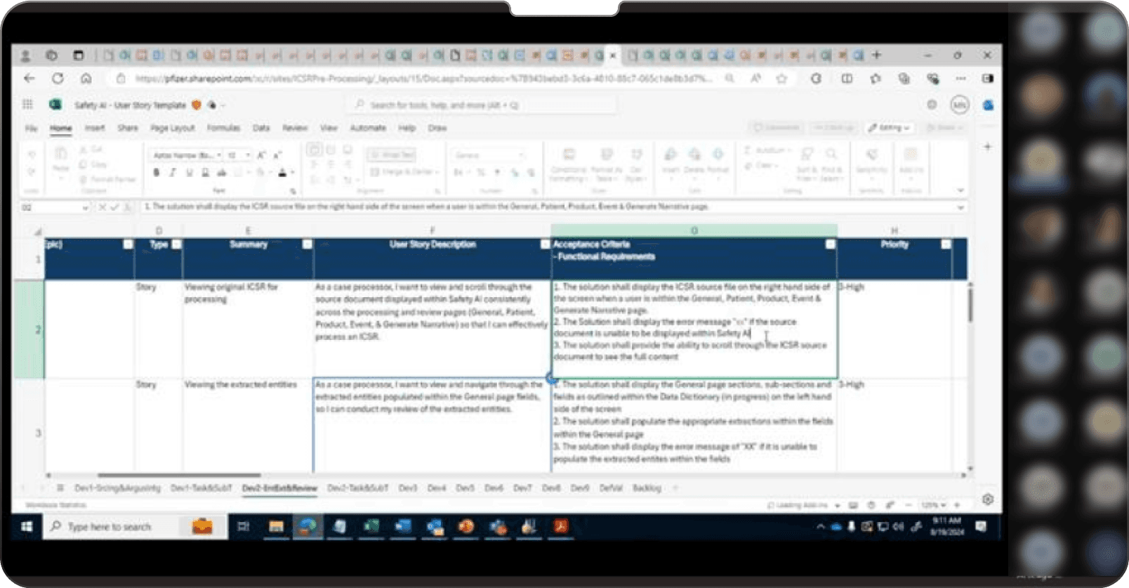
Images showing user stories captured from workshops with users and business people
After that, We started on the design adapting the client’s brand guidelines and this was the first design we shown for validation….


But guess what, ️This design was not approved by the business. Let’s see why and how we incorporated the feedback and came with better solution
User’s Feedback
Looking at Source file is confusing, We want it to be more structured.
Is it Possible to make more entities visible within the frame?
It is not mandatory for us to see the scores
Field Names are little confusing to map with the data
“So, After connecting with users and ourselves, We had a goal to make the design more readable, clean and also incorporating all those feedbacks. Also, We planned to work on one section at once.”
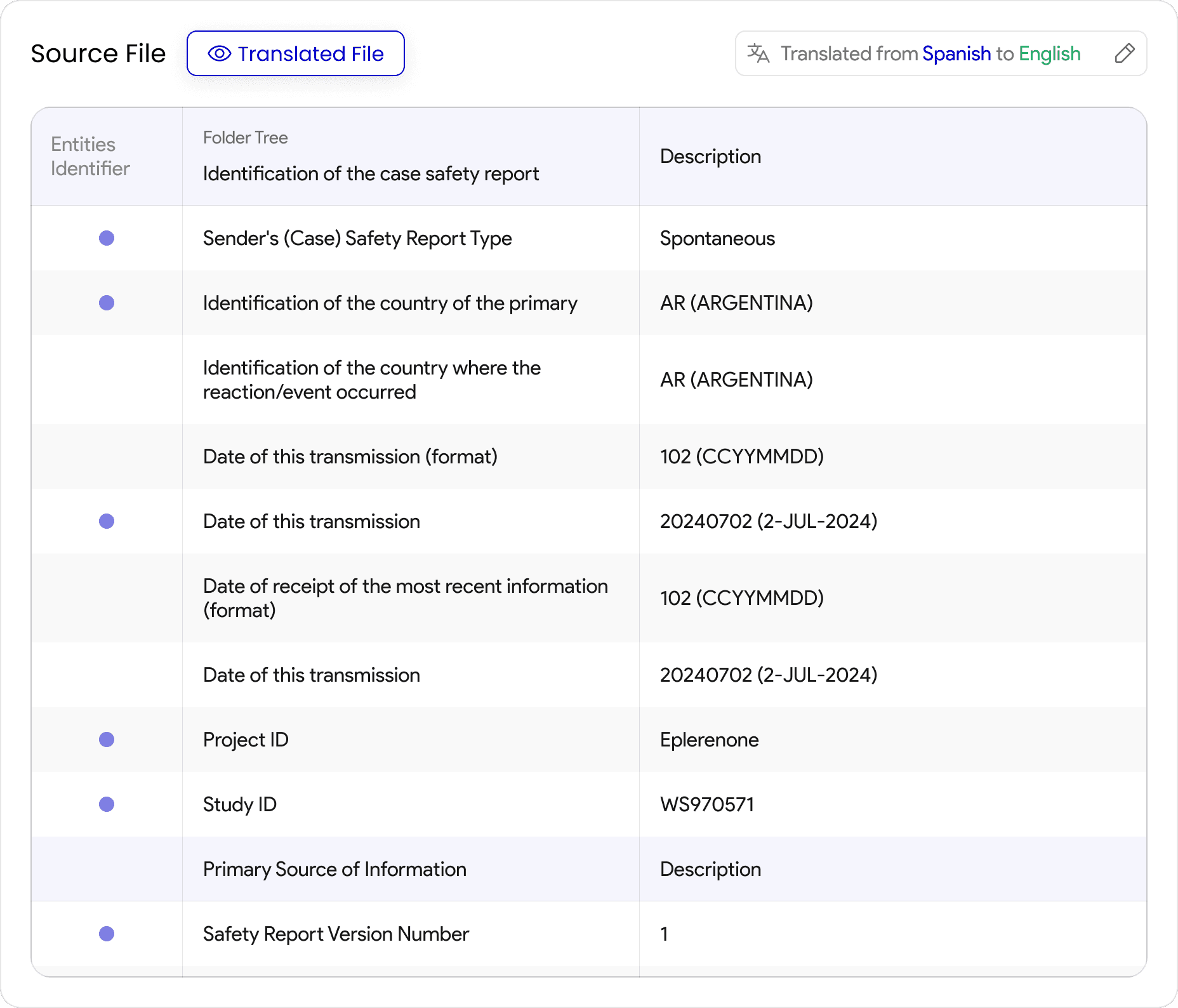
Source Section
For Input section, I did some deep research and found out that these users were previously using Table Structured format for source file, So I thought giving the same look helps it recognizable and easy to understand.
Recognizable Format
More Structured
Pointers for easy Identification
Before Feedback

After Feedback
Key Changes
Designed the Source Tags in a structured table format
Added pointers to easily identify the tags where the extraction has happened
Categorizing the Source Information
Output Section
For Output section, It was really challenging as Users wants to see more entities within the frame but not easy as we have lot of indications to show for each of them. Finally, I came to an conclusion.
More Output Data to be Visible
Categorizing Tags
Collapsible Overall Categories
Before Feedback

After Feedback
Key Changes
We felt scores doesn’t mean much as users only going to see if it’s a good or bad, so we replaced scores with Thumb for easy Indication.
Added pointers to easily identify the tags where the extraction has happened
Categorizing the Source Information
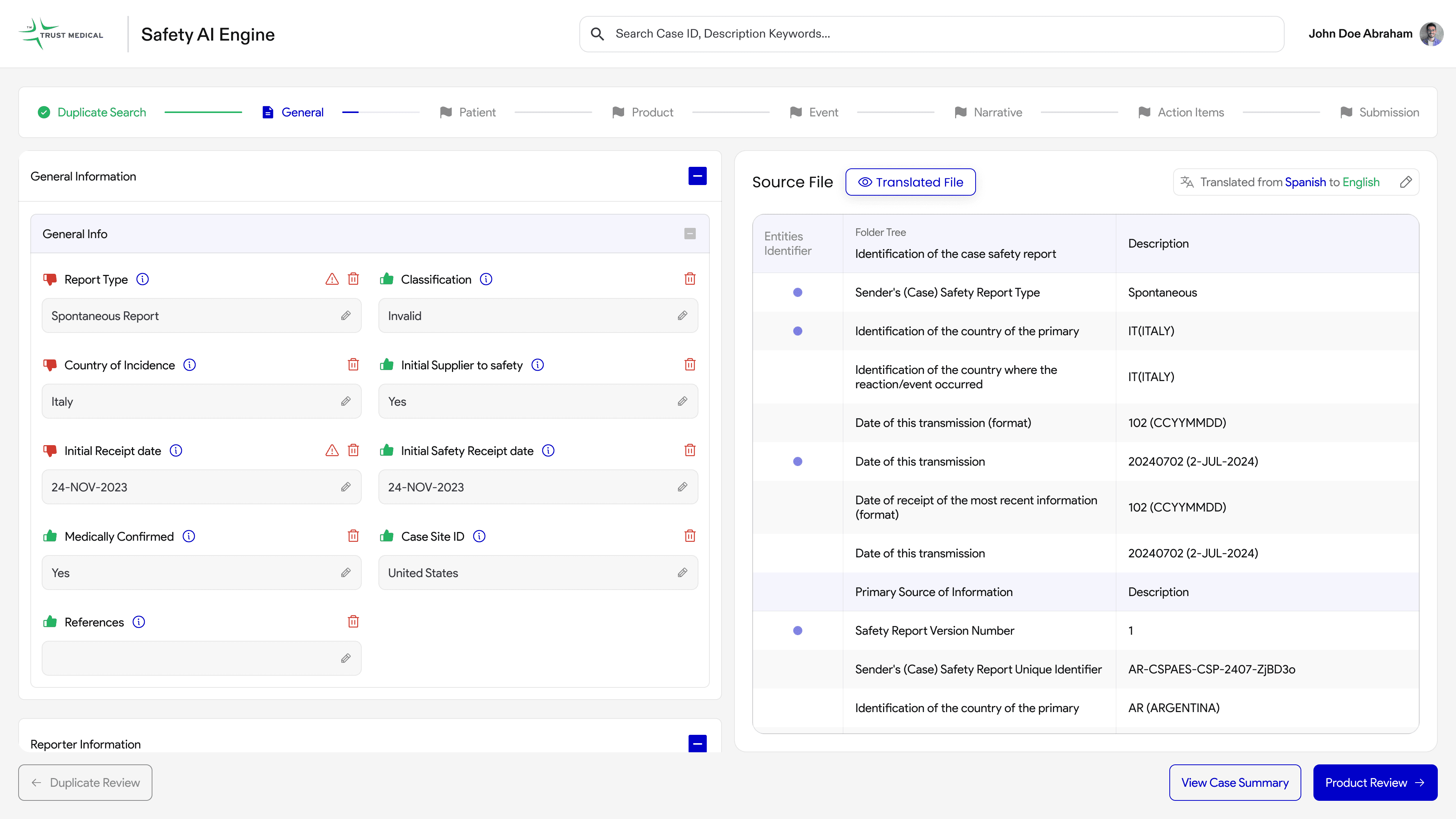
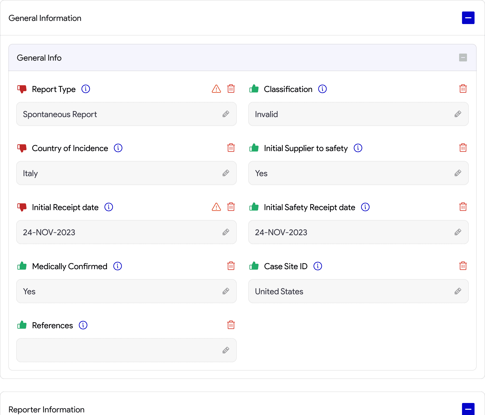
General Tab
Now, Incorporating these together for General Tab with identifying the functionalities for easier navigation. Let’s see how we did this.
Requirements from Business
Less Interaction
Easy to Identify & Navigate between Tags
Traceable between Source and Output
Collapsible Cards for Better Usability
Clear icons and labels ensure content is discoverable, with important details visible upfront.
They minimize scrolling and work well for hierarchical or grouped content.
Collapsible cards reduce clutter, making it easier for users to focus on key information.
Easy Traceability
The table on the right organizes data and pointers, making it easy to select and map tags on the left.
When a pointer is selected, the corresponding tag on the left gets highlighted instantly, creating a clear connection.
This setup reduces manual effort, keeps things intuitive, and ensures accurate tagging.
I’ve added visual cues like highlights and an option to undo selections to make it user-friendly and error-proof.

So, This design was validated and approved by the business SMEs which helped us figure out the layout for other screens as well
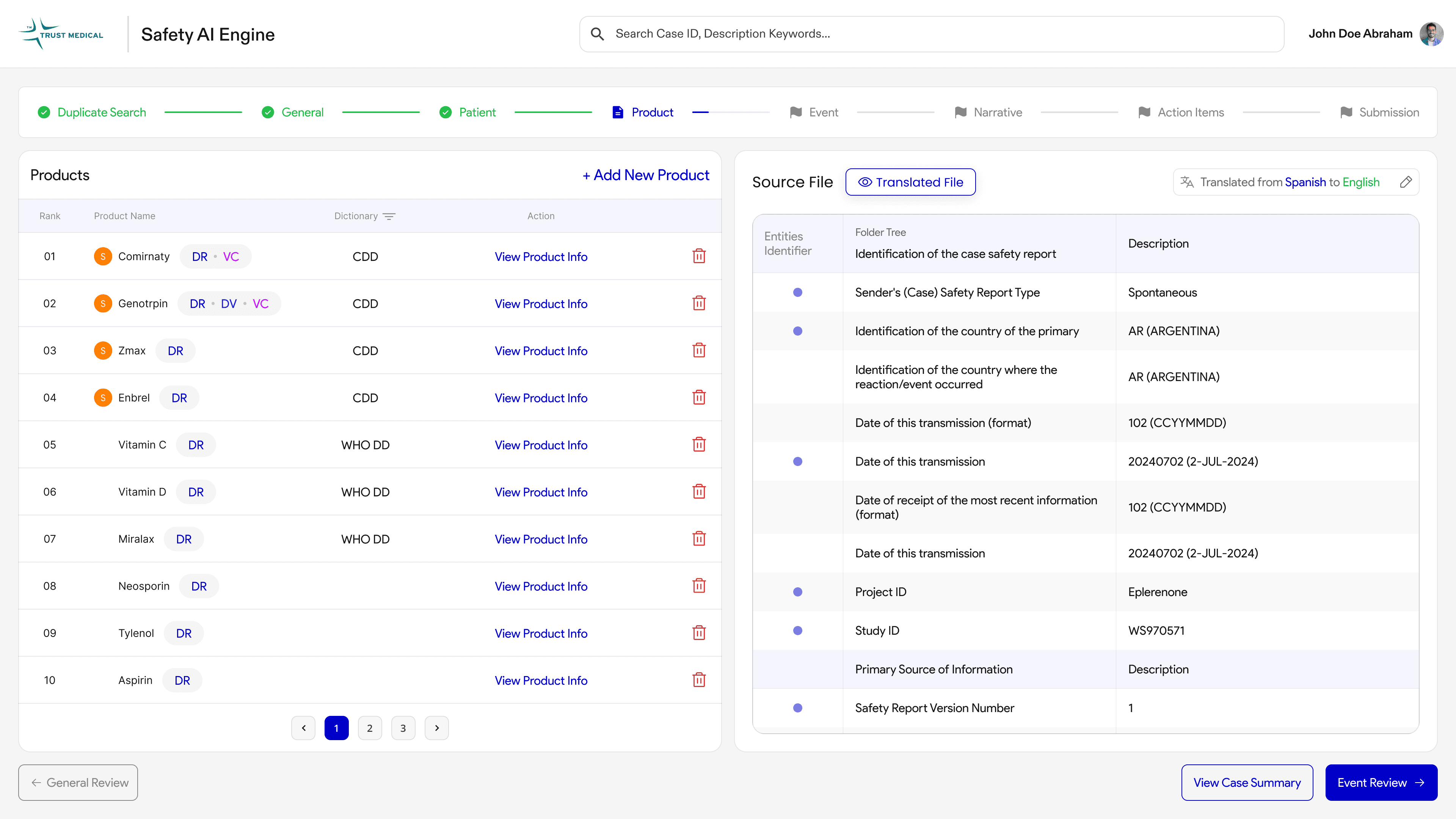
Product Tab
After completing the General tab, the next step is the Product tab. This section allows users to identify and manage products extracted from the source file. It ensures that these products are correctly linked with their respective coded dictionaries for consistency and accuracy.
Defining Output Section for Product Tab
To display product information effectively, we chose a table layout. The table provides a clear structure for presenting each product and its associated details, ensuring the data is easily understandable.
Research:
During the research phase, we discovered that users were accustomed to the table format. However, the existing implementation was cluttered and required manual input, leading to inefficiency and errors. Our solution focuses on automating this process while retaining the familiar table format. By prioritizing readability and a clean interface, we ensured the design aligns with users' needs while improving usability.
Output:
The redesigned table layout offers a seamless, user-friendly experience, balancing familiarity with enhanced functionality.

Outcomes
MVP Phase 01
In this phase, we successfully completed the General Tab and Product Tab, meeting the primary goals for the MVP release.
Improved user satisfaction by delivering a clean, user-friendly design tailored to the users' workflow.
Reduced time and effort required for completing tasks, thanks to automation and streamlined interfaces.
Successfully established a strong foundation for subsequent phases of the project.
Ensured alignment with business goals by addressing pain points and creating a scalable, efficient solution.
Learnings
Owning the entire design process as the sole designer was challenging, requiring adaptability and focus.
Collaborating closely with developers and data scientists helped deepen my understanding of LLMs and their real-world applications.
The cross-functional collaboration enhanced my problem-solving skills and fostered a collaborative mindset for future projects.
Gained valuable insights into how design can effectively complement complex systems like AI and data science.

Portfolio 2024
Behance
AVAILABLE FOR JOB
Transforming ICSR Reporting: Reducing Case Processing Time by 40% and Boosting Productivity with Gen AI Automation
Project Overview
Our client, a leading pharmaceutical company, faced challenges with their manual Individual Case Safety Report (ICSR) tool. The existing process was prone to errors, time-consuming, and impacted regulatory compliance. To address these issues, we collaborated with the client to automate the reporting process using Generative AI. Our goal was to streamline workflows, reduce human involvement, and enhance user experience without disrupting established processes.
Team
Designer (Me),
UX Architect, Product SME,
3 Backend Dev, 2 Frontend Dev,
3 LLM Scientists, 1 Data Engineer
Client Impact
40%
Improved Accuracy
1.5x
Enhanced Productivity
80%
Reduced Manual Interaction
100%
On-Time Report
17%
Reduced Operational Costs
Highlights of the Project
Users struggled to prioritize tasks in ICSR, leading to delays and inefficiency. We created a dashboard that categorizes tasks by priority, streamlining workflows. This resulted in faster task completion and a drop in missed deadlines.
Users spent too much time manually finding names, emails, and details in the general view. With AI-powered mapping, details are now extracted instantly, saving time and effort.
On the product page, users can find relevant medical products through AI-driven search. Relevant products are extracted automatically, saving time and significantly reducing errors.
Introduction:
Why are we doing this? A journey from POC --> Prod Env
So, As we have successfully completed the Proof of Concept phase, Business where satisfied and gave us green signal for Production. In this stage, I was the only designer working alongside our PM, Devs and Data Scientist team. Finally, They have liked the entire Idea and we are now in Phase 1 of the Production for ICSR.
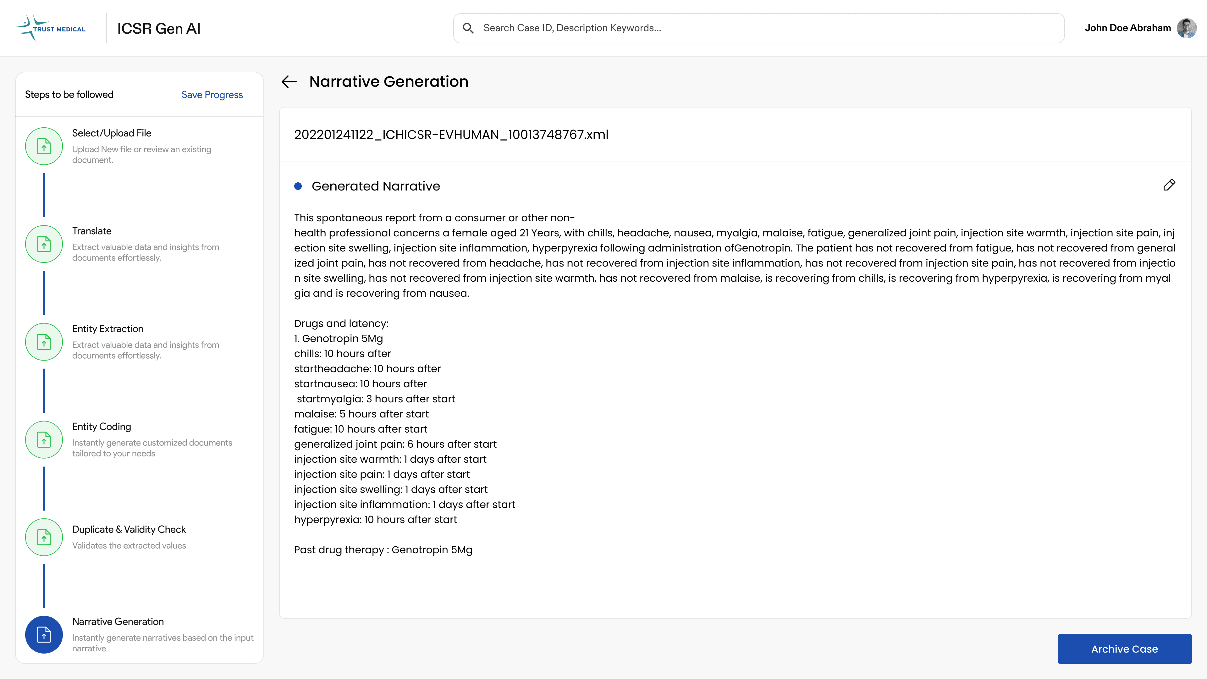
Some Glimpses from POC:
So, We tracked some key impacts and Business Efficiencies that needs to be Identified and Processed in this Production
Manual Process Time
Each case took around 45 minutes to process.
Accuracy Rate
Only 85%, leading to frequent errors.
Productivity
Limited to 10 reports per user per day.
Defining Process
Understanding Key Deliverables and Timeline
As we Started, We got along with the team to understand the timeline and key deliverables and the sprint module. I was accompanied by Solution Architect and Business SME for this production. And we were planning how the Design is going to happen from scratch to deliver.
As we are going to follow
Agile Methodology, We must
Discover by connecting with clients to gather user stories.
Define the solutions based on research and insights.
Ideate and build designs collaboratively.
Validate the designs with business and users for feedback.
Finally, hand off the designs to development.
DISCOVER
DEFINE
IDEATE
VALIDATE
ITERATE
ITERATE
So, We did...
Validate Design Solutions with Business/Users
Defining the Solutions
Conduct Workshops to Gather User Stories

General Tab
Designing General Tab brings 90% of the solution as these are the key elements throughout the product, So, We took this sprint to make sure we get this right.
After that, We started on the design adapting the client’s brand guidelines and this was the first design we shown for validation….
But guess what, ️This design was not approved by the business. Let’s see why and how we incorporated the feedback and came with better solution
We Initially Started with Deep Research to Understand User Needs and Define MVP1
Workshops with Stakeholders and Users:
We started by conducting workshops with business stakeholders and end-users to understand their workflows, challenges, and expectations. These sessions helped us uncover key pain points and areas for improvement.
First Sprint Focused on User Insights:
The first sprint was dedicated entirely to gathering insights and translating them into user stories. This ensured our work was aligned with real user needs and priorities.
Identifying Critical Features for MVP1:
Through this process, we identified the most critical features to include in MVP1, focusing on solutions that would deliver the most value to users.
Images showing user stories captured from workshops with users and business people
User’s Feedback
Looking at Source file is confusing, We want it to be more structured.
Is it Possible to make more entities visible within the frame?
It is not mandatory for us to see the scores
Field Names are little confusing to map with the data
“So, After connecting with users and ourselves, We had a goal to make the design more readable, clean and also incorporating all those feedbacks. Also, We planned to work on one section at once.”
Source Section
For Input section, I did some deep research and found out that these users were previously using Table Structured format for source file, So I thought giving the same look helps it recognizable and easy to understand.
Recognizable Format
More Structured
Pointers for easy Identification
Before Feedback
After Feedback
Key Changes
Designed the Source Tags in a structured table format
Added pointers to easily identify the tags where the extraction has happened
Categorizing the Source Information
Output Section
For Output section, It was really challenging as Users wants to see more entities within the frame but not easy as we have lot of indications to show for each of them. Finally, I came to an conclusion.
More Output Data to be Visible
Categorizing Tags
Collapsible Overall Categories
Before Feedback
After Feedback
Key Changes
We felt scores doesn’t mean much as users only going to see if it’s a good or bad, so we replaced scores with Thumb for easy Indication.
Added pointers to easily identify the tags where the extraction has happened.
Categorizing the Source Information.
General Tab
Now, Incorporating these together for General Tab with identifying the functionalities for easier navigation. Let’s see how we did this.
Requirements from Business
Less Interaction
Easy to Identify & Navigate between Tags
Traceable between Source and Output
Collapsible Cards for Better Usability
Clear icons and labels ensure content is discoverable, with important details visible upfront.
They minimize scrolling and work well for hierarchical or grouped content.
Collapsible cards reduce clutter, making it easier for users to focus on key information.
Easy Traceability
The table on the right organizes data and pointers, making it easy to select and map tags on the left.
When a pointer is selected, the corresponding tag on the left gets highlighted instantly, creating a clear connection.
This setup reduces manual effort, keeps things intuitive, and ensures accurate tagging.
I’ve added visual cues like highlights and an option to undo selections to make it user-friendly and error-proof.
So, This design was validated and approved by the business SMEs which helped us figure out the layout for other screens as well
Product Tab
After completing the General tab, the next step is the Product tab. This section allows users to identify and manage products extracted from the source file. It ensures that these products are correctly linked with their respective coded dictionaries for consistency and accuracy.
Defining Output Section for Product Tab
To display product information effectively, we chose a table layout. The table provides a clear structure for presenting each product and its associated details, ensuring the data is easily understandable.
Research:
During the research phase, we discovered that users were accustomed to the table format. However, the existing implementation was cluttered and required manual input, leading to inefficiency and errors. Our solution focuses on automating this process while retaining the familiar table format. By prioritizing readability and a clean interface, we ensured the design aligns with users' needs while improving usability.
Output:
The redesigned table layout offers a seamless, user-friendly experience, balancing familiarity with enhanced functionality.

Outcomes
MVP Phase 01
In this phase, we successfully completed the General Tab and Product Tab, meeting the primary goals for the MVP release.
Improved user satisfaction by delivering a clean, user-friendly design tailored to the users' workflow.
Reduced time and effort required for completing tasks, thanks to automation and streamlined interfaces.
Ensured alignment with business goals by addressing pain points and creating a scalable, efficient solution.
Successfully established a strong foundation for subsequent phases of the project.
Learnings
Owning the entire design process as the sole designer was challenging, requiring adaptability and focus.
Collaborating closely with developers and data scientists helped deepen my understanding of LLMs and their real-world applications.
The cross-functional collaboration enhanced my problem-solving skills and fostered a collaborative mindset for future projects.
Gained valuable insights into how design can effectively complement complex systems like AI and data science.
Transforming ICSR Reporting: Reducing Case Processing Time by 40% and Boosting Productivity with Gen AI Automation
Project Overview
Our client, a leading pharmaceutical company, faced challenges with their manual Individual Case Safety Report (ICSR) tool. The existing process was prone to errors, time-consuming, and impacted regulatory compliance. To address these issues, we collaborated with the client to automate the reporting process using Generative AI. Our goal was to streamline workflows, reduce human involvement, and enhance user experience without disrupting established processes.
Team
Designer (Me), UX Architect, Product SME, 3 Backend Dev,
2 Frontend Dev, 3 LLM Scientists, 1 Data Engineer
Highlights of the Project
Users struggled to prioritize tasks in ICSR, leading to delays and inefficiency. We created a dashboard that categorizes tasks by priority, streamlining workflows. This resulted in faster task completion and a drop in missed deadlines.
Users spent too much time manually finding names, emails, and details in the general view. With AI-powered mapping, details are now extracted instantly, saving time and effort.
On the product page, users can find relevant medical products through AI-driven search. Relevant products are extracted automatically, saving time and significantly reducing errors.
Introduction:
Why are we doing this? A journey from POC --> Prod Env
So, As we have successfully completed the Proof of Concept phase, Business where satisfied and gave us green signal for Production. In this stage, I was the only designer working alongside our PM, Devs and Data Scientist team. Finally, They have liked the entire Idea and we are now in Phase 1 of the Production for ICSR.
Some Glimpses from POC:
So, We tracked some key impacts and Business Efficiencies that needs to be Identified and Processed in this Production
Manual Process Time
Each case took around 45 minutes to process.
Accuracy Rate
Only 85%, leading to frequent errors.
Productivity
Limited to 10 reports per user per day.
Defining Process
Understanding Key Deliverables and Timeline
As we Started, We got along with the team to understand the timeline and key deliverables and the sprint module. I was accompanied by Solution Architect and Business SME for this production. And we were planning how the Design is going to happen from scratch to deliver.
As we are going to follow Agile Methodology, We must
Discover by connecting with clients to gather user stories.
Define the solutions based on research and insights.
Ideate and build designs collaboratively.
Validate the designs with business and users for feedback.
Finally, hand off the designs to development.
DISCOVER
DEFINE
IDEATE
VALIDATE
ITERATE
ITERATE
So, We did...
Validate Design Solutions with Business/Users
Defining the Solutions
Conduct Workshops to Gather User Stories
General Tab
Designing General Tab brings 90% of the solution as these are the key elements throughout the product, So, We took this sprint to make sure we get this right.
After that, We started on the design adapting the client’s brand guidelines and this was the first design we shown for validation….
But guess what, ️This design was not approved by the business. Let’s see why and how we incorporated the feedback and came with better solution
We Initially Started with Deep Research to Understand User Needs and Define MVP1
Workshops with Stakeholders and Users:
We started by conducting workshops with business stakeholders and end-users to understand their workflows, challenges, and expectations. These sessions helped us uncover key pain points and areas for improvement.
First Sprint Focused on User Insights
The first sprint was dedicated entirely to gathering insights and translating them into user stories. This ensured our work was aligned with real user needs and priorities.
Identifying Critical Features for MVP1
Through this process, we identified the most critical features to include in MVP1, focusing on solutions that would deliver the most value to users.
Images showing user stories captured from workshops with users and business people
User’s Feedback
Looking at Source file is confusing, We want it to be more structured.
Is it Possible to make more entities visible within the frame?
It is not mandatory for us to see the scores
Field Names are little confusing to map with the data
“So, After connecting with users and ourselves, We had a goal to make the design more readable, clean and also incorporating all those feedbacks. Also, We planned to work on one section at once.”
Source Section
For Input section, I did some deep research and found out that these users were previously using Table Structured format for source file, So I thought giving the same look helps it recognizable and easy to understand.
Recognizable Format
More Structured
Pointers to Identify
Before Feedback
After Feedback
Key Changes
Designed the Source Tags in a structured table format.
Added pointers to easily identify the tags where the extraction has happened.
Categorizing the Source Information.
Output Section
For Output section, It was really challenging as Users wants to see more entities within the frame but not easy as we have lot of indications to show for each of them. Finally, I came to an conclusion.
More Output Data to be Visible
Categorizing Tags
Collapsible Overall Categories
Before Feedback
After Feedback
Key Changes
We felt scores doesn’t mean much as users only going to see if it’s a good or bad, so we replaced scores with Thumb for easy Indication.
Added pointers to easily identify the tags where the extraction has happened.
Categorizing the Source Information.
General Tab
Now, Incorporating these together for General Tab with identifying the functionalities for easier navigation. Let’s see how we did this.
Requirements from Business
Less Interaction
Easy to Identify & Navigate between Tags
Traceable between Source and Output
Collapsible Cards for Better Usability
Clear icons and labels ensure content is discoverable, with important details visible upfront.
They minimize scrolling and work well for hierarchical or grouped content.
Collapsible cards reduce clutter, making it easier for users to focus on key information.
Easy Traceability
The table on the right organizes data and pointers, making it easy to select and map tags on the left.
When a pointer is selected, the corresponding tag on the left gets highlighted instantly, creating a clear connection.
This setup reduces manual effort, keeps things intuitive, and ensures accurate tagging.
I’ve added visual cues like highlights and an option to undo selections to make it user-friendly and error-proof.
So, This design was validated and approved by the business SMEs which helped us figure out the layout for other screens as well
Product Tab
After completing the General tab, the next step is the Product tab. This section allows users to identify and manage products extracted from the source file. It ensures that these products are correctly linked with their respective coded dictionaries for consistency and accuracy.
Defining Output Section for Product Tab
To display product information effectively, we chose a table layout. The table provides a clear structure for presenting each product and its associated details, ensuring the data is easily understandable.
Research:
During the research phase, we discovered that users were accustomed to the table format. However, the existing implementation was cluttered and required manual input, leading to inefficiency and errors. Our solution focuses on automating this process while retaining the familiar table format. By prioritizing readability and a clean interface, we ensured the design aligns with users' needs while improving usability.
Output:
The redesigned table layout offers a seamless, user-friendly experience, balancing familiarity with enhanced functionality.
Outcomes
MVP Phase 01
In this phase, we successfully completed the General Tab and Product Tab, meeting the primary goals for the MVP release.
Improved user satisfaction by delivering a clean, user-friendly design tailored to the users' workflow.
Reduced time and effort required for completing tasks, thanks to automation and streamlined interfaces.
Successfully established a strong foundation for subsequent phases of the project.
Ensured alignment with business goals by addressing pain points and creating a scalable, efficient solution.
Learnings
Owning the entire design process as the sole designer was challenging, requiring adaptability and focus.
Collaborating closely with developers and data scientists helped deepen my understanding of LLMs and their real-world applications.
The cross-functional collaboration enhanced my problem-solving skills and fostered a collaborative mindset for future projects.
Gained valuable insights into how design can effectively complement complex systems like AI and data science.
Client Impact
40%
Improved Accuracy
1.5x
Enhanced Productivity
80%
Reduced Manual Interaction
100%
On-Time Report
17%
Reduced Operational Costs